library(tidyverse)
theme_set(theme_bw())
cols <- c(
    "gender", "name", "weight", "height", "method"
)
transport <- "data/transport.csv" |>
    read_csv(
        comment = "#",
        col_names = cols,
        col_types = "-ccnnc"
    ) |>
    mutate(
        gender = case_when(
            gender == "F" ~ "female",
            gender == "M" ~ "male",
            TRUE ~ str_to_lower(gender)
        ),
        gender = as.factor(gender),
        method = factor(
            method,
            levels = c("car", "bike")
        ),
        BMI = weight / (0.01 * height) ^ 2
)Putting It All Together: Advanced Plotting
Introduction to R For Biologists and Bioinformatics
September 19, 2023
A Simple X-Y Plot
- When plotting, we can simply pipe the data into
ggplot
transport |>
    ggplot(aes(height, weight)) +
geom_point()![]()
Adding Lines of Best Fit
- Sometimes a regression line can be informative
geom_smooth()guesses the best linemethod = 'loess'isn’t that great here
transport |>
    ggplot(aes(height, weight)) +
    geom_point() +
geom_smooth()![]()
Adding Regresion Lines
- We can choose a linear regression line:
method = "lm"- We fit linear regression in
Rusing the functionlm() - Hide the standard error of the regression line:
se = FALSE
- We fit linear regression in
transport |>
    ggplot(aes(height, weight)) +
    geom_point() +
geom_smooth(method = "lm", se = FALSE)![]()
Customising Parameters
- We can change the colour of the line:
colour = "black"- Anything set inside
aes()should be a column in your data - Anything set outside of
aes()should be a fixed-value - Can also set
linetype,linewidth,alphaetc
- Anything set inside
transport |>
    ggplot(aes(height, weight)) +
    geom_point() +
    geom_smooth(
        method = "lm", se =  FALSE,
        colour = "black"
)![]()
Changing Shapes
- Similarly for the points:
colour = "grey30"- The range of shapes is visible using
?pch - For shapes 21-25 colour is outline, fill is the internal colour
- The range of shapes is visible using
transport |>
    ggplot(aes(height, weight)) +
    geom_point(colour = "grey30", shape = 1) +
    geom_smooth(
        method = "lm", se =  FALSE,
        colour = "black"
)![]()
Changing Shapes
- We can also set any character to be the point
shape- Additional parameters include
size,alpha
- Additional parameters include
transport |>
    ggplot(aes(height, weight)) +
    geom_point(
        colour = "grey30", shape = "#", size = 4
    ) +
    geom_smooth(
        method = "lm", se =  FALSE,
        colour = "black"
)![]()
Parameters Inside or Outside aes()
- Parameters set outside
aes()will over-ride anything insideaes()- We have globally set colour to depend on
gender - This is overridden by both
geom_point()andgeom_smooth()
- We have globally set colour to depend on
transport |>
    ggplot(
        aes(height, weight, colour = gender)
    ) +
    geom_point(
        colour = "grey30", shape = "#", size = 4
    ) +
    geom_smooth(
        method = "lm", se =  FALSE,
        colour = "black"
)![]()
Parameters Inside or Outside aes()
- Now remove the colour from
geom_point()- Inherits from the
aes()withinggplot()
- Inherits from the
transport |>
    ggplot(
        aes(height, weight, colour = gender)
    ) +
    geom_point(shape = "#", size = 4) +
    geom_smooth(
        method = "lm", se =  FALSE,
        colour = "black"
)![]()
Custom Scales
- Providing specific colours can take a vector
- Can be named for greater control
transport |>
    ggplot(
        aes(height, weight, colour = gender)
    ) +
    geom_point(shape = "#", size = 4) +
    geom_smooth(
        method = "lm", se =  FALSE,
        colour = "black"
    ) +
    scale_colour_manual(
        values = c(
            female = "navyblue", male = "red3"
        )
)![]()
Custom Scales
- Likewise for shapes
- Values are applied in the same order as the legend
transport |>
    ggplot(
        aes(height, weight, colour = gender)
    ) +
    geom_point(
        aes(shape = gender), size = 4
    ) +
    geom_smooth(
        method = "lm", se =  FALSE,
        colour = "black"
    ) +
    scale_colour_manual(
        values = c(
            female = "navyblue", male = "red3"
        )
    ) +
    scale_shape_manual(
        values = c("F", "M")
)![]()
Adding Statistics
- Sometimes we might wish to add summary statistics to plots
- We can create on the fly inside a geom_
transport |>
    ggplot(aes(height, weight)) +
    geom_point(
        aes(colour = gender, shape = gender),
        size = 3
    ) +
    geom_smooth(
        method = "lm", se =  FALSE,
        colour = "black"
    ) +
    geom_label(
        aes(label = label),
        data = . %>% ## Only the magrittr works here
            summarise(
                cor = cor(weight, height),
                height = mean(height),
                ## Specify a position manually
                # height = 165,
                weight = min(weight),
            )  %>%
            mutate(
                label = paste("rho ==", round(cor, 2))
            ),
        parse = TRUE
    ) +
    scale_colour_manual(
        values = c(
            female = "navyblue", male = "red3"
        )
    ) +
    scale_shape_manual(
        values = c("F", "M")
)![]()
Using Additional Packages
stat_poly_eq()can add \(R^2\), adjusted \(R^2\) or regression equations
transport |>
    ggplot(aes(height, weight)) +
    geom_point(
        aes(colour = gender, shape = gender),
        size = 3
    ) +
    geom_smooth(
        method = "lm", se =  FALSE,
        colour = "black"
    ) +
    stat_poly_eq(use_label("eq")) +
    scale_colour_manual(
        values = c(
            female = "navyblue", male = "red3"
        )
    ) +
    scale_shape_manual(
        values = c("F", "M")
)![]()
Multiple Regression Equations
- Combining with facets can provide multiple equations
transport |>
    ggplot(aes(height, weight)) +
    geom_point(
        aes(colour = gender, shape = gender),
        size = 3
    ) +
    geom_smooth(
        method = "lm", se =  FALSE,
        colour = "black"
    ) +
    stat_poly_eq(use_label("eq")) +
    facet_wrap(~method) +
    scale_colour_manual(
        values = c(
            female = "navyblue", male = "red3"
        )
    ) +
    scale_shape_manual(
        values = c("F", "M")
)![]()
Creating a Barplot
- Now we can create a barplot using
geom_col()
transport |>
    summarise(
        mn_bmi = mean(BMI),
        sd_bmi = sd(BMI),
        .by = c(method, gender)
) |>
ggplot(aes(method, mn_bmi, fill = gender)) +
geom_col() +
facet_wrap(~gender) +
labs(y = "Mean BMI") +
scale_fill_brewer(palette = "Set2") ![]()
Adding Error Bars
- We add error bars using
geom_errorbar()
transport |>
    summarise(
        mn_bmi = mean(BMI), sd_bmi = sd(BMI),
        .by = c(method, gender)
    ) |>
    ggplot(aes(method, mn_bmi, fill = gender)) +
    geom_col() +
    geom_errorbar(
        aes(
            ymin = mn_bmi - sd_bmi,
            ymax = mn_bmi + sd_bmi
        ),
        width = 0.2
    ) +
    facet_wrap(~gender) +
    labs(y = "Mean BMI") +
scale_fill_brewer(palette = "Set2") ![]()
Adding Error Bars
- If we choose not to facet it’s much trickier
- Let’s hide the error bars to see why
transport |>
    summarise(
        mn_bmi = mean(BMI), sd_bmi = sd(BMI),
        .by = c(method, gender)
    ) |>
    ggplot(aes(method, mn_bmi, fill = gender)) +
    geom_col(position = "dodge") +
    labs(y = "Mean BMI") +
scale_fill_brewer(palette = "Set2") ![]()
Plotting with Factors
transport |>
    summarise(
        mn_bmi = mean(BMI), sd_bmi = sd(BMI),
        .by = c(method, gender)
    ) |>
    mutate(
        method_int = as.integer(method),
        x = case_when(
            gender == "female" ~ method_int - 0.225,
            gender == "male" ~ method_int + 0.225,
        )
    ) |>
    ggplot(aes(method, mn_bmi, fill = gender)) +
    geom_col(position = "dodge") +
    geom_errorbar(
        aes(
            x = x,
            ymin = mn_bmi - sd_bmi,
            ymax = mn_bmi + sd_bmi
        ),
        width = 0.1
    ) +
    labs(y = "Mean BMI") +
scale_fill_brewer(palette = "Set2") ![]()
Modifying Axes
- We also label them using the
nameargument
transport |>
    summarise(
        mn_bmi = mean(BMI), sd_bmi = sd(BMI),
        .by = c(method, gender)
    ) |>
    mutate(
        method_int = as.integer(method),
        x = case_when(
            gender == "female" ~ method_int - 0.225,
            gender == "male" ~ method_int + 0.225,
        )
    ) |>
    ggplot(aes(method, mn_bmi, fill = gender)) +
    geom_col(position = "dodge") +
    geom_errorbar(
        aes(
            x = x,
            ymin = mn_bmi - sd_bmi,
            ymax = mn_bmi + sd_bmi
        ), width = 0.1
    ) +
    scale_fill_brewer(
        palette = "Set2", name = "Gender"
    ) +
    scale_y_continuous(
        expand = expansion(c(0, 0.05)),
        name = "Mean BMI"
)![]()
Plotting Multiple Summaries
- Hide the y-axis name using
name = c()
summ_df |>
    mutate(
        gender_int = as.numeric(gender),
        x_bar = case_when(
            method == "car" ~ gender_int - 0.225,
            method == "bike" ~ gender_int + 0.225
        )
    ) |>
    ggplot(aes(gender, mn, fill = method)) +
    geom_col(position = "dodge") +
    geom_errorbar(
        aes(
            x = x_bar,
            ymin = mn - sd, ymax = mn + sd
        ),
        width = 0.2
    )  +
    facet_wrap(~stat, scales = "free_y") +
    scale_fill_brewer(
        palette = "Set2", name = "Method"
    ) +
    scale_y_continuous(
        expand = expansion(c(0, 0.05)),
        name = c()
) 
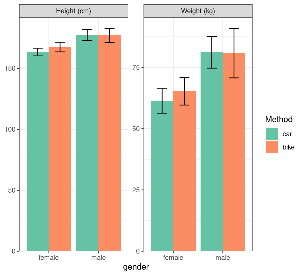
Plotting Multiple Summaries
- Add the units to the facet names
summ_df |>
    mutate(
        gender_int = as.numeric(gender),
        x_bar = case_when(
            method == "car" ~ gender_int - 0.225,
            method == "bike" ~ gender_int + 0.225
        ),
        stat = stat |>
            str_replace("height", "Height (cm)") |>
            str_replace("weight", "Weight (kg)")
    ) |>
    ggplot(aes(gender, mn, fill = method)) +
    geom_col(position = "dodge") +
    geom_errorbar(
        aes(
            x = x_bar,
            ymin = mn - sd, ymax = mn + sd
        ),
        width = 0.2
    )  +
    facet_wrap(~stat, scales = "free_y") +
    scale_fill_brewer(
        palette = "Set2", name = "Method"
    ) +
    scale_y_continuous(
        expand = expansion(c(0, 0.05)), name = c()
) 
Using Themes
- If we try to add a title, it’s aligned left
p + ggtitle("Weight and Height Across Participants")
Using Themes
hjustcontrols the horizontal adjustmenthjust = 0.5is centre-aligned
p +
    ggtitle("Weight and Height Across Participants") +
    theme(plot.title = element_text(hjust = 0.5))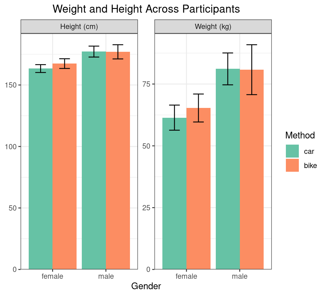
Using Themes
- We can resize all primary text
p +
    ggtitle("Weight and Height Across Participants") +
    theme(
        text = element_text(size = 14),
        plot.title = element_text(hjust = 0.5)
    )
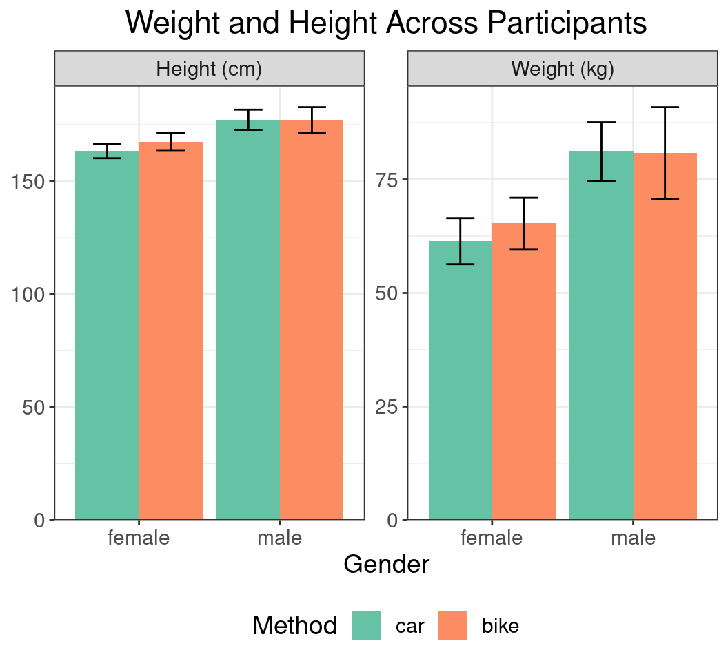
Using Themes
- Control legend position
- Doesn’t need an
element_*()function
- Doesn’t need an
p +
    ggtitle("Weight and Height Across Participants") +
    theme(
        text = element_text(size = 14),
        plot.title = element_text(hjust = 0.5),
        legend.position = "bottom"
    )
Using Themes
- Hide the background grid & rotates x-axis text
p +
    ggtitle("Weight and Height Across Participants") +
    theme(
        text = element_text(size = 14),
        plot.title = element_text(hjust = 0.5),
        legend.position = "bottom",
        panel.grid = element_blank(),
        axis.text.x = element_text(
            angle = 90, vjust = 0.5, hjust = 1
        )
    )
Closing Comments
- Can now (hopefully) make the figures for our next paper
ggplot2is very powerful \(\implies\) takes a long time to master- Getting data structured correctly is an important part
- Note that once we loaded data \(\implies\) never modified
- We saved four objects
cols,transport,summ_df,p- The last two were only to fit the code on slides
- This keeps a clean workspace
- No need for
transport,transport1,transport1_modetc - Very beneficial for reproducibility
- No need for
![]()